Wallace and I had planned to pop off into the city at 10 on Sunday, but didn't really get rolling until 10:30. We didn't stay out very long either, we just headed over to the cathedral for some sketching. I wanted to see the inside of the church, but there were people begging for change in the doorway and I didn't really want to deal with that. We moseyed back home as the sun started peeking out from the clouds, and we decided to change into bathing suits and hit La Concha beach.
I like the steeple. It's not a solid construction, it looks kind of like a stone lace.
Beach time was nice! I brought my thrilling book, "The Necessity for Ruins" (hint: it's not thrilling at all), and some pringles and hunkered down for some sun time. We both swam out into the water to a floating dock, which was deceptively far away. But even when the water is 10 meters deep, you can still see straight to the floor. It is insane.
The rest of our day was filled with chilling and walking around the city, trolling for eats. We also watched James and the Giant Peach on Wallace's laptop. Monday wasn't much more eventful, either. Our last morning in San Sebastian was spent walking around the city one last time. I really like the small town vibe that this place has, while also being really densely packed.
At 1:20, we bid our hosts goodbye and trekked over to the bus station. It was a nice walk, but any walk where you're toting a huge backpack in 70+ degree heat is going to be a little miserable. We were a little panicky too, our bus didn't show up until about a minute before it was scheduled to leave. Both Wallace and I made it on board though and rode in comfort all the way to Bilbao.
We took the metro to the main plaza and walked from there to our hostel (which took us a while to find). The metro stations were designed by Norman Foster, the same architect who did the dome on to of the Reichstag building in Berlin. Funnily enough, Hanna and Rebecca were in the same hostel, and Wallace and I got put in the same room as them.
Norman Foster metro entrance
That night, we ventured out to the Guggenheim museum to see it all lit up. Sadly, it's closed on Mondays, so it wasn't lit up. But it was still very cool to see. We also ventured over to the bridge designed by Calatrava. It was a nice nighttime adventure.
Why hello there, Guggenheim, it's a pleasure to finally meet you
It wasn't all lit up like usual because it was a Monday, and the museum is closed on Mondays
The fountain next to the museum
I love how the titanium shines in the moonlight
Reflections in the river
The bridge, by Santiago Calatrava. We creeped on his house in Zurich.
Sadly my camera battery died right after this photo...
Hanna and Rebecca left for Madrid at 8am on Tuesday, and Wallace and I prepared for a day in Bilbao. We were on the streets by 9:30 and didn't come home until 5, which was nice. We haven't had a full day of buildings since Basel. We stopped by some cool office buildings, popped into H&M (I FOUND THE SKIRT I WANTED IN PARIS AND I BOUGHT IT. WHAT.), and moseyed back to the Guggenheim.
A statue for Gehry, in the shape of crumpled up paper. The joke is that he designs his buildings by crumpling up paper and throwing it, then making a building in the shape of the paper
Beautiful
This building is such a cool building. Most architects are polarized when it comes to Gehry, they either think he's awesome or he's full of baloney. I appreciate the man's imagination and ingenuity- he comes up with some of the craziest forms you can think of, and he finds a way to build it and make his ideas a reality. It's the perseverance, the creativity, the "not letting architectural precedents hold you back" mentality that inspire me. True, his buildings are wiggly woggly and sometimes look silly, but he puts so much thought into his designs that I cringe when people just dismiss him as an architect.
Outside and inside
The building is dominated by wiggly titanium clad forms and (what I think is) travertine tile volumes. They all join together to create gallery space on the inside. Some of the spaces are curvalinear, others are orthagonal (wavy walls versus straight walls and right angles), but the curators find ways to display art in all of them.
Look, some balloon flowers!
Crazy curves
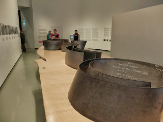
My favorite room was a vast hall filled with steel sculptures by Richard Cerra. We saw a couple of his works when we were in Berlin and Basel, but this room was FULL of massive steel sheets that bend and flop to create inhabitable space. They're very fun to walk through, sound echoes and bounces off the steel in really interesting ways. What struck me though is how many people walked through the steel without making sounds, just walking and looking. To me, half the point is to snap your fingers and make silly robot noises, just to hear how it reverberates.
I'm pretty sure the space was designed with these sculptures in mind.
Little models of each sculpture!
The leaning sheets were my favorite
Pika and Sully liked them too
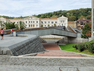
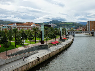
We spent nearly 2 hours at the museum. In the afternoon, we got lunch at a nice cafe, visited a library, and visited the Puente de Deustu bridge. And we made sure to save a lot of things to do for the other two days we are here. I'm really excited for the rest of my time in Bilbao now!
Inside the library
I'm a sucker for a neat bridge
Exterior of the library
What's on the right and the left of the bridge!


Oooh curvy buildings! That is so cool :) Love the crumpled paper sculpture, too. You take such awesome photos!
ReplyDelete