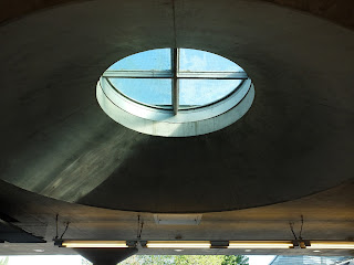
There have been some beautifully designed subway stations on this trip.
While we were lost, Heiner tried to cover up his mistake by pointing out random elements on the surrounding buildings. C Channel glass on a parking structure, and movable shutters!
We visited a church site that was designed by one architect on one plot of land, with two churches on it, one Catholic and one Protestant. It's very interesting to compare and contrast two different worship spaces, the rooms that people worship in really say a lot about the religion they practice.
They share a steeple
The Protestant church had a beautiful lattice structure in the ceiling, and all of the seats were movable chairs arranged in a circle.
The Catholic Church had four very beautiful stained glass pieces, fixed seating with (very uncomfortable) kneelers, and far more pomp and circumstance.
I ended up getting left behind in a courtyard while I was sketching, and I couldn't find the group again. So I sat my butt down and waited for someone to notice I was gone. I waited for like ten minutes before walking to the front of the church, when I saw Heiner. Turns out no one noticed I was gone- awesome.
My prison.
We caught the bus and visited a cemetery nearby. Cemeteries here play the roles of burial place and funeral home at the same time. So it's a lot you need to think about when designing a cemetery. There was a viewing hallway, with windows to rooms where caskets and flowers are on display before being placed in the ground. As luck would have it, someone's casket was on display, so we all admired the architecture of the space by their viewing window. It felt a little weird at first- my Uncle Frank died at 102 on Sunday, and I couldn't help but think of how weird it would be if 20 architecture students stood at his body's feet to admire the architecture around him. But there are weirder things that could happen to your body I suppose.
The main structure of the building was made of concrete, and the entire building looked like it was folded over onto itself, with boxes of rooms tucked inside.
The viewing corridor
The Germans really love their board-formed concrete. It makes the concrete pick up the texture of the wood formwork.
Out to the graveyard!
The graveyard was laid out nicely too. Each grave had a little garden planted on it- flowers and shrubs and all were tended and looked nice. I think that's a nicer way to spend your time in the ground than we do it in the USA- with a little marker and some fake flowers in a vase.
Heiner told us that the tour officially ended after lunch, but he was going to go on a walk and we could join if we wanted. So I hopped on, and we visited a Rococco church, two baroque churches, an orthodox synangogue, a market, lots of buildings, and a mall redesigned by Herzog & deMuron. It was definitely worth going on, even though my feet wanted to fall off by the end of it.
The Rococco style is the most opulent, absurd, gawdy style of architecture I've ever seen.
This is an Orthodox Synagogue. Four of us were able to get inside to look at it. It was stunning- the light that came through the metal structure on the top illuminated the entire worship space. Our guide thought the architecture was too modern, though. No photos were allowed, which I liked- now I get to keep the experience all in my head :)
SHRIMP. A lemon is next to them for scale.
One Baroque Church...
Two Baroque Churches!
I preferred the solid white one. I thought it had a better feeling than the other one. A monochromatic color scheme can be very beautiful.
A courtyard we walked by, near the King's Palace
A metal sculpture in the Herzog & deMuron mall
A blurry photo of the hanging lights and leaves in one of the atria
Many many small reflective glass circles placed in the wall. The hallway and green window were interesting- the exterior of this space was a historic facade. The window and door matched up with the old openings, so the facade wasn't compromised or changed at all, but on the inside they carved a new path to walk through.
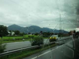
Rain rain, go away.
Bregenz is a small town (apparently the size of Blacksburg, VA) in Austria, nestled in the foothills of the Alps. There's a lake here and other things, but we didn't get to see much of it because of rain. Nothing is more of a bummer than rain to a group of architects who mostly travel by foot. We did stop at a monastery, though, and admired the Baroque church there.
Inside the Baroque church
Before we checked into our hostel, we stopped by the office of Baumschlager & Eberly, a famous architecture firm in Europe. They have ten offices all over the world, and the newly completed building in Bregenz is the leader in the world of sustainable architecture. The building is a cube (24 cubic meters), with a very interesting facade. It's covered in chalk plaster (made locally from the stone from the mountains) and looks like it's been pushed back in places. It's a dynamic facade, which makes the building look much nicer than a simple white cube on the land.
You can see how the facade is pushed back in these photos. Also, I love the edge condition between the building and the gravel. It rises so simply from the ground.
The whole building has no mechanical systems inside of it. No heating or cooling at all. The entire building is made of concrete, which is a thermally massive material. During the day it absorbs heat from the sun and redistributes it. If it ever gets too hot, a computer system (or a person) opens one of the 8 ventilation windows on each floor. It was designed entirely by the architecture firm, no engineers were used. So, it is "entirely architecture", which is a cool concept. Most students and young architects forget to make room for important things like fire stairs and ductwork, so finding a way to make a clean, smart, beautiful building is an achievement for sure.
The first step of the staircase is flush with the concrete floor. Our guide showed us how the floor is constructed- a main concrete subfloor, 7 cm of air space where cords are run, and then a thin topping slab that people walk on.
They had a James Tourell exhibit on display in the main floor of the building.
These lamps were hanging in the restaurant of the office. Each individual lamp costs as much as a car. Architecture is expensive.
We arrived at our hostel, which is a "youth" hostel. And it literally means youth. There are hoards of small children running around here. I have no idea what they're doing in Bregenz, but they are here nonetheless. The rooms are really cool though- the hostel was once an old factory and was renovated. So the rooms have very tall ceilings and really awesome loft spaces.
I had an architect moment today. So, I bought two sketchbooks to take with me on this trip- an 11x14 one (which is heavy and I hate it) and a very small 3x5 landscape format sketchbook. I never dreamed I would fill either one, but lo and behold I finished the small sketchbook on Wednesday. It was perfect for me and I looked in Berlin for another sketchbook to replace it, but I didn't see any in landscape form, so I bought a nice cheery yellow sketchbook with a world map in it. Cool, right?
WRONG. I used it for the first time today and I am so upset. First of all, the book is too fat, so I can't fit it in the back of my pants (I usually carry my sketchbooks in the small of my back). Second of all, the paper is so thin that you can see what I write on one side through to the other. So that means if I want to do a sketch, I can't write on the other side of the page. IT'S AWFUL. I need to think of a way to use it though, because I paid 22 euro for it and I'm NOT throwing it away. I'm just doomed to be dissatisfied.


No comments:
Post a Comment