The day started off an hour later; Heiner oh so graciously allowed us to sleep in. Our first stop of the morning was the Freie University Library, designed by Norman Foster. It's a double skinned dome attached to the regular university. The panels in the dome are glass and an opaque material, which diffuse the sunlight outside so that the whole space gets an even amount of light.
The entrance from inside
The floors wave and undulate around the perimeter, and all the desks are located at the perimeter of the floors. This way, all of the desks have access to the natural light, while the stacks are located more centrally in the floor (away from the light). After all, books like to sleep in the dark.
I love the photos I'm taking this trip... :)
We spent almost two hours here, sketching and walking around. Photos weren't allowed per se, but I snuck my camera in under my scarf and managed to take some shots of the incredible space.
The connection between the library and the university
Post Modernism was a movement in architecture to get back to the "true meaning" of architecture. The New York Five (Michael Graves, Peter Eisenmann, Charles Gwathme, Richard Meyer, and John Heijduk) all had their own opinions for post modernism, from meaning to color to syntax to dematerialization. Really, what it ended up with (in my professional opinion) was a lot of buildings that look like crap. It took these guys a while to really hammer out their ideas in ways that don't look dated now. After all, this movement was in the 80s.
Categorized by fake keystones, arches that protrude from the facade, and really really crappy plaster exteriors.
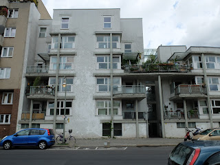
Berlin held the IBA, or the International Building Exhibition. Archiects from all over designed and built social housing for the exhibition. Sadly, the latest exhibition was in the 80s, during the prime of Post Modernism. So there's a butt ton of ugly public housing in Berlin.
I think it looks like a cat face.
This is actually a very nice building by Herman Hertzberger. It looks icky now, but usually it has some beautiful ivy growing on the exterior.
We also visited Checkpoint Charlie, one of the three entrances through the wall to East Berlin. There were some "US Soldiers" taking photos with tourists here. Pretty sure they were German.
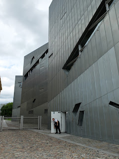
We ended the day at the Jewish Museum. We studied this building a few years ago, and everyone typically likes it. We were told that the architect, Daniel Liebeskind, derived the zigzag shape by drawing lines through Berlin to the different victims of the Holocaust. Thoughtful, right? Apparently, says Heiner the professor, Liebeskind just really likes that angular shape. So he made it because he wanted to. And I mean let's be real here, if you made arbitrary lines connecting every single Holocaust victim, your map would be solid red with lines.
The exterior is clad in zinc
Really, Liebeskind designed this building for himself. It is a museum, yes, but it would be such a better building if it was completely empty. There are many light wells and voids and paths and some really interesting moments for sure, but they are almost cheapened by the exhibits on display. Which is a shame, since it's a museum and you're not going to just keep an empty building empty because it looks nice.
I don't know how I feel about the building anymore. I liked it as a student, but now that I've been in, know how it looks and feels, and know that Liebeskind really just designed it for his own sake, my opinion has changed. It asks some good questions too- do you design a space because it is beautiful, or because of what will ultimately be in the space?
A tree tunnel and the cafe area.
My sketches are greatly improving. I sketched for over an hour at the library and I sketch out when we walk around. I'm often left behind or the last person in a spot because I'm finishing up a sketch. I want to get better! And my time is definitely paying off, so that's a wonderful fantastic thing. Some of us got together Sunday night to look at each others' sketchbooks, and mine was the most full. I'm going to need to buy another one very very soon.
On Monday, we visited only two buildings on the southeast of town- the Berlin Crematorium and the Dutch Embassy.
The Crematorium is like our funeral homes. There's a law in Berlin though that you can't take ashes home from the crematorium, so everyone who goes there is buried there. There's a building proper where funeral services are held, and then grounds of parks where people are buried.
The main entrance and the grounds plan
The ivy is turning pink :)
The building proper is visually divided into three section on the outside. There are chimneys on the side of the building with an exaggerated shape. We talked about icons in architecture with this building, how sometimes a building needs recognizable features (that can be exaggerated, like weird shaped chimneys) in order for people to identify with its purpose.
The interior has a main gathering space with a congregation of concrete columns and three chapel spaces. The columns are incredible- they are "disconnected" from the ceiling, which gives the illusion that the ceiling is unsupported across the entire space. It's very striking and beautiful.
There's an egg floating, suspended above the fountain in the center. Probably symbolic for new life.
The chapel spaces were striking. The main hall is very hollow and echoes loudly, but the chapels are quieter, deader sounding, and smell of incense.
We spent a couple hours here, sketching and photographing. We moved on to the Dutch Embassy after lunch, where we got tours of the building (designed by Rem Koolhaas). Photography wasn't allowed, so I sketched and diagrammed.
The building was very thought out, with half floors and lots of windows. Each room has a view into another room or hallway of the building. And if you stand in a location outside, you can see straight through the building to the TV tower in Alexanderplatz.
We ended our day by visiting an architecture firm in Berlin. The guy (VT alum!) who gave us the tour told us all that one of the most valuable thing we could do for our career is to work abroad. So, now I have no idea what I'm going to do after I graduate. It opened a lot of questions in my mind about what I want to do with my life and where I want to live and work. GUH not what I wanted to deal with.
Word to your mother.


No comments:
Post a Comment